
Main menu
You are here
Stage 4: Sketching biologically meaningful relationships
What we now have are some variables in our model ( and ) for introducing biologically-meaningful relationships. The influence arrows we have drawn to these two variables expresses the biologically-reasonable assumptions that:
- the number of rabbits eaten per fox, , depends on the number of rabbits; and
- the number of baby foxes produced per fox, , depends on the number rabbits eaten per fox.
So far, however, we have retained the simplistic assumptions from the conventional model: we have asumed that the number of rabbits eaten per fox is directly proportional to the number of rabbits; and that the rate of reproduction per fox is directly proportional to the number of rabbits eaten. In reality, both assumptions are way off the mark: if there are lots of rabbits around, then foxes reach a limit of how many they can eat. Similarly, even if foxes succeed in eating many rabbits, there is an upper limit to the number of offspring they can produce per year.
How can we incorporate these refinements?
We have two options. One is to find some mathematical expression that better captures our understanding. If you are mathematically inclined, you might like to give that a try. The other is to exploit Simile’s ability to draw a sketch graph of any relationship between two variables, and that’s what we’ll do here.
| Step 1 |
Open up the Equation dialogue window for the variable eaten per fox, and delete the existing expression.
|
| Step 2 |
Click on the
 graph button graph button |
| Step 3 |
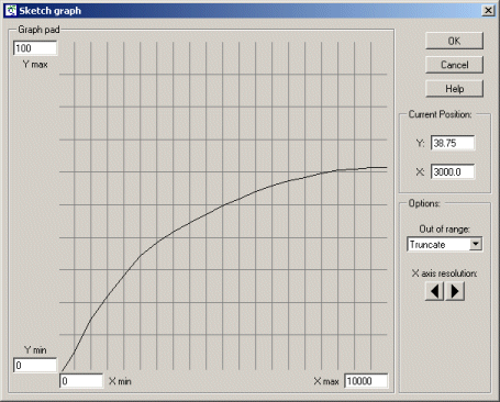
Scale the X axis (representing number of rabbits), by entering a value of 10000 in the Xmax edit box at the right of the X axis.
|
| Step 4 |
Scale the Y axis (number of rabbits eaten per fox per year), by entering a value of 100 in the edit box at the top of the y axis.
|
| Step 5 |
Move the mouse into the graphpad area, and move the mouse around while holding down the mouse button.
Notice how you can adjust the position of the line showing the relationship between the Y and X axes. |
| Step 6 |
Adjust it so that it passes through the origin at (0,0), and rises up smoothly till it reaches a plateau (asymptotic) value, looking something like this:
When Simile comes to run the model, it will use linear interpolation to work out what the value on the Y axis is knowing the value on the X axis. |
| Step 7 |
Click on the Enter button to close the sketch graph window.
|
| Step 8 |
In the main Equation window, Simile has entered the text graph( ) into the equation field. Insert the name of the rabbits compartment between the brackets, so that the expression now read: graph(rabbits)
|
| Step 9 |
Open up a graph pad in the Equation dialogue window for the variable rfox, and delete the existing expression.
We are now going to sketch the relationship between , the number of foxes produced per fox per year, and , the number of rabbits eaten per fox per year. |
| Step 10 |
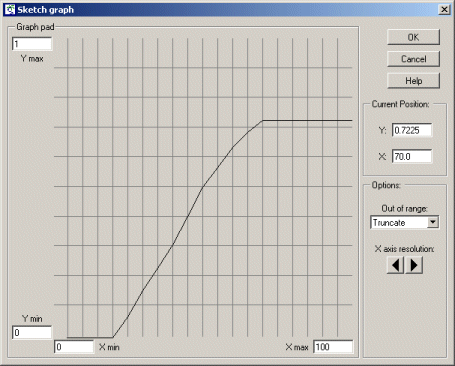
Scale it, setting Xmax to 100 and Ymax to 1.
Note that the Xmax value (100) is the same as the Ymax value in the previous sketch graph. This is because they actually refer to the same variable: number of rabbits eaten per fox per year. The value of 1 for the Y axis indicates that foxes cannot produce more than 2 baby foxes per year. |
| Step 11 |
Sketch a graph looking something like this:
Before reading the rest of this comment, try to figure out for yourself what this is saying... It shows that a fox does not reproduce at all when its food intake is below some lower threshold. After that, its rate of reproduction is directly proportional to the amount of additional food consumed, up to some maximum, plateau level: the maximum number of young it can produce per year. |
| Step 12 |
Click on the Enter button to close the sketch graph window.
|
| Step 13 |
Edit the expression so that it reads graph(eaten_per_fox).
Note that the variable whose label is (with spaces between the words) is written as eaten_per_fox in the equation. This is because some characters which are allowed in labels are not allowed in variables in expressions. Note that Simile always lists the influencing variables at the bottomof the Equation window, so you can always check on what spelling it’s using. |
| Step 14 |
Rebuild the model, and run it again.
You should notice a difference in the shape of the graphs, reflecting the changes in the model. |
- Printer-friendly version
- Log in or register to post comments
This opens up a separate graph pad window.
The scaling for each axis is determined by the Xmin, Xmax and Ymin, Ymax edit boxes. The graph pad area (initially a horizontal line running through the middle of the graph pad) which can be adjusted up and down using the mouse.